The Power of Visual Choice
Every image has its own language. Printing a photograph is more than reproduction. It is translating emotion into something tangible. The choice between black and white and color changes how that story feels. Some visuals thrive in the simplicity of monochrome, while others depend on the richness of color.
This discussion is not about which is superior. It is about understanding how each version influences mood, attention, and interpretation. A black and white print draws viewers inward, letting them study light, shape, and contrast. A color print is louder because it uses colors and shades to show energy and life. The best impact often depends on where and how you display it.
Understanding the Core Difference
Black and white photography simplifies reality. By removing color, it highlights structure, emotion, and depth. It helps the viewer focus on details that might otherwise get lost, such as a wrinkle, a shadow, or the grain of a surface. Monochrome images often feel timeless because they avoid the influence of trend or palette.
Color photography expands the expressive range. It connects instantly because we live in color. The red of a dress, the green of trees, or the soft blue of dawn adds emotional cues that the human brain reads immediately. These signals tell stories faster and make scenes feel more real.
Knowing this contrast helps you decide which suits your purpose—quiet power or vibrant energy.
When Black & White Works Best
Black and white printing finds strength in restraint. When you remove color, the viewer pays attention to light, form, and texture. Every shadow becomes meaningful, and every tone shift feels deliberate.
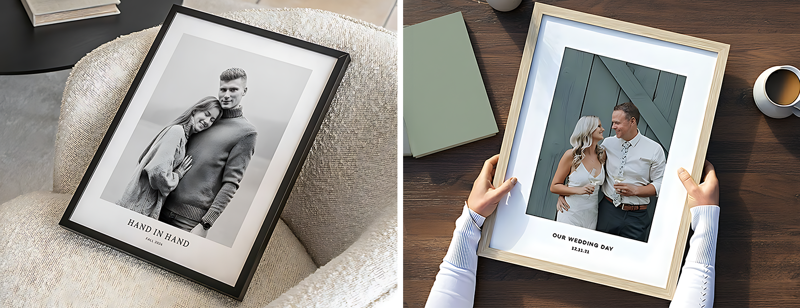
You might choose black and white when emotion outweighs environment. Portraits, street scenes, and architectural images often gain depth through this style. A custom canvas print in monochrome can bring an intimate quality to modern interiors, especially when the goal is elegance rather than brightness.
Black and white also helps when you want your audience to focus on shape and emotion rather than setting. In product photography or conceptual art, it removes distractions and keeps the eye centered on composition.
Pros of Black and White Prints:
- Highlights tone, texture, and contrast
- Feels timeless and classic
- Suitable for portraits and fine art
- Easy to match with any décor or theme
Cons of Black and White Prints:
- Lacks color emotion and realism
- May appear too muted for lively spaces
- Subtle variations in light can be harder to control during printing
On textured materials like matte paper or custom art prints, black and white adds velvety depth and quiet drama.
When Color Makes the Stronger Impression
If black and white speaks softly, color makes a confident statement. Color photography draws power from visual emotion. Every hue carries feeling—yellow adds warmth, blue brings calm, and red demands attention.
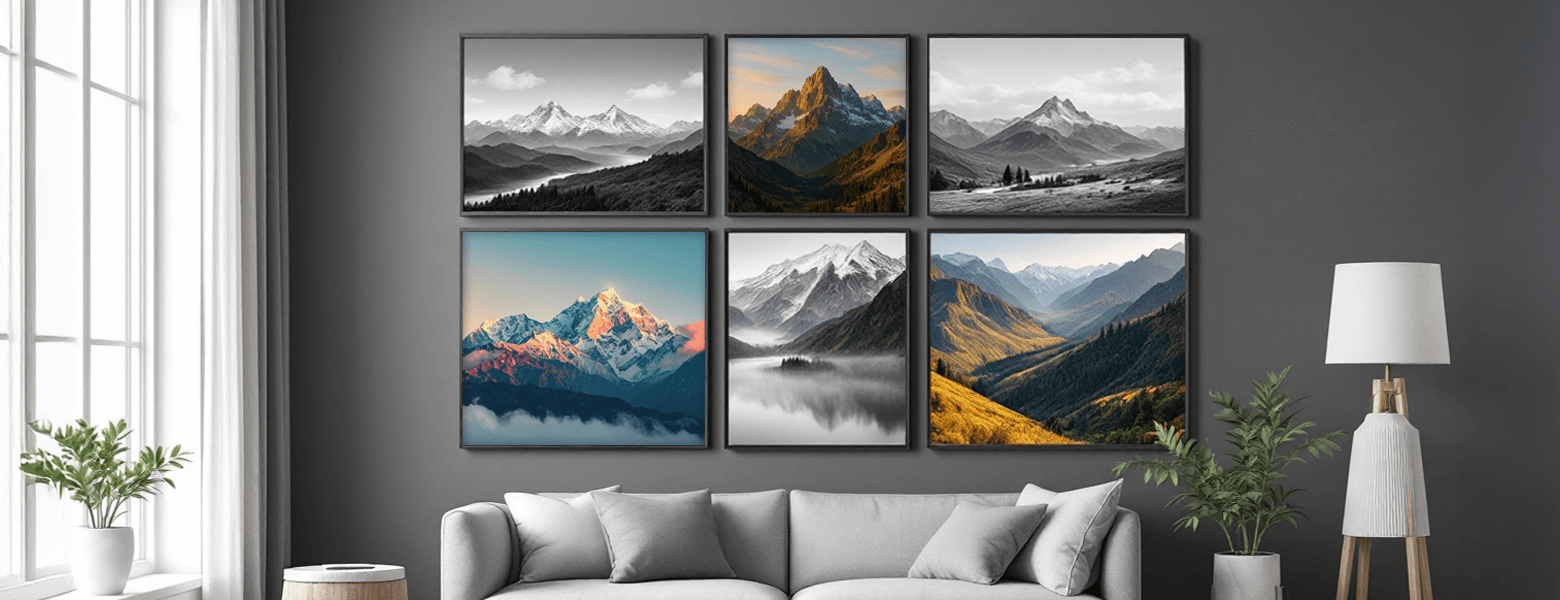
In practical terms, color prints often work better for storytelling. They bring realism and emotional connection that black and white cannot replicate. A travel landscape, a family portrait, or an art piece meant to energize a room benefits from full-spectrum color.
Acrylic Prints amplify this effect with depth and gloss, making colors bold and radiant. Vinyl Banners also rely on vibrant color for visibility and impact, especially in outdoor or commercial environments.
Pros of Color Prints:
- Captures emotion, realism, and atmosphere
- Ideal for décor, branding, and lifestyle imagery
- Engages viewers instantly with energy and tone
- Works across a wide range of print materials
Cons of Color Prints:
- May distract from subject or emotion if over-saturated
- Colors can fade under direct light without UV protection
- Requires careful calibration for consistency across devices
Glossy mediums like Economy Poster Prints keep color vivid and clear.
Where Each Fits Best
Choosing between black and white and color is often about placement. The right choice depends on the space, purpose, and audience.
Home Décor: Black and white prints blend seamlessly with minimalist or neutral interiors. Color prints work better for family rooms or creative spaces that need warmth and personality.
Corporate or Office Settings: Monochrome images bring a refined tone to meeting rooms and hallways. Color visuals brighten collaborative areas and reception spaces.
Galleries and Exhibitions: Black and white feels contemplative in galleries, while color commands attention in mixed-media displays.
Branding and Commercial Use: For advertising or promotional displays, color wins. It is vital for identity and recall. Bright, consistent colors create recognition and energy in prints like paper banner printing or Vinyl Banners.
Photography Genres: Portraits and documentary photos excel in monochrome. Landscapes, travel, and lifestyle work better in color because they rely on light and hue for storytelling.
Comparison at a Glance
| Aspect | Black & White Prints | Color Prints |
| Visual Focus | Emphasizes shape, texture, light | Highlights hue, atmosphere, and mood |
| Emotional Tone | Dramatic, reflective, timeless | Expressive, lively, modern |
| Best Suited For | Portraits, architecture, fine art | Advertising, décor, landscapes |
| Material Match | Canvas, matte, fine art paper | Acrylic, vinyl, glossy paper |
| Visual Longevity | Less prone to fading | Needs UV protection for durability |
| Production Needs | Precision in contrast and tone | Calibration for accurate color |
| Viewer Impact | Subtle and thought-provoking | Immediate and emotional |
This table is not about declaring a winner. It shows that each approach shines under different conditions.
Visual Contrast in Practice: Monochrome vs. Color
The best way to understand impact is to see both side by side.
- A city street at dusk: In black and white, the focus falls on texture, symmetry, and shadow. In color, golden tones bring out warmth and liveliness, turning the same scene into a story of motion and energy.
- A portrait in natural light: Monochrome highlights expression and mood. In color, skin tones and background hues create connection and realism.
- A nature landscape: In black and white, you notice the shapes of mountains and clouds. In color, the sky’s gradient and greenery add freshness and depth.
- A product shot: Monochrome lends sophistication and minimalism. Color reveals texture and brand personality, which is crucial for marketing visuals.
Each version has power—one introspective, one expressive.
When to Choose Which (and When Not To)
There is no universal rule, but a few cues can help you decide.
Choose Black and White When:
- Form and emotion take the lead. If the subject’s power lies in expression, shadow, or structure, black and white brings it to life.
- You want timeless impact. It removes distractions and keeps attention on detail and story.
- Lighting and contrast matter most. Portraits, architecture, and still-life compositions benefit from tonal balance.
- You are aiming for mood or minimalism. It turns ordinary frames into artistic statements.
Avoid it when your subject depends on color cues, such as branding visuals, nature shots, or fashion photography where color defines personality.
Choose Color When:
- The image depends on tone and energy. Color captures vibrancy, realism, and atmosphere better than any filter can.
- You want emotional warmth. Bright hues communicate mood instantly, ideal for décor, advertising, and lifestyle prints.
- Context demands realism. When true-to-life detail matters, color is unmatched.
Avoid it when the image feels cluttered or loses focus due to too many competing hues.
Pro Tip:
When ordering in bulk, use bulk printing services to test both versions side by side. Print the same shot in black and white and in color. Then place each in different lighting environments. Sometimes, the space itself decides which version makes the stronger impact.
The Hybrid or Mixed Approach
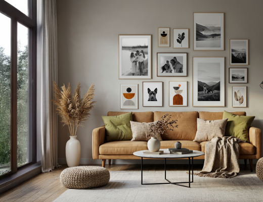
You do not always need to pick one side. A thoughtful mix of black and white and color prints can make your collection feel balanced and layered. A gallery wall might begin with calm, monochrome portraits and transition into vivid color landscapes. This rhythm keeps attention moving and makes the display more dynamic.
In corporate environments, combining both styles works equally well. Black and white prints set a professional tone, while color visuals energize the space. For creative professionals, alternating between both allows emotional range without breaking theme or tone.
Modern print formats make this blending easier. A combination of custom art prints in grayscale with Acrylic Prints in full color can create depth within the same display. Each image supports the other by contrast, forming a unified story across the wall.
The Practical Side of Printing
Whether you print in monochrome or color, precision matters. Each format has its own technical needs. Black and white prints require fine contrast adjustments, while color prints need calibrated screens and printers for tone accuracy.
Consider viewing conditions too. Warm indoor light can shift color perception, while bright white lighting can make black and white appear sharper. When printing at large scale or on materials like vinyl Banners or Acrylic Prints, always proof-check the sample to ensure tones and density match expectations.
Small steps ensure professional results, especially for custom canvas prints or long-lasting displays.
Balance Over Bias
There is no single winner in the black and white vs color photography discussion. Each speaks a different visual language. Black and white reveals emotion through simplicity. Color celebrates energy and life. Both have artistic and practical importance.
Your decision should depend on message, mood, and environment. Some stories need silence; others need sound. A timeless portrait might lose honesty in color, while a lively cityscape might lose its pulse without it.
Great photographers know when to use each—or blend both. With modern options like custom canvas prints and Acrylic Prints, it is not about choosing forever. It is about choosing what fits your story.

No Comments